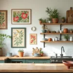
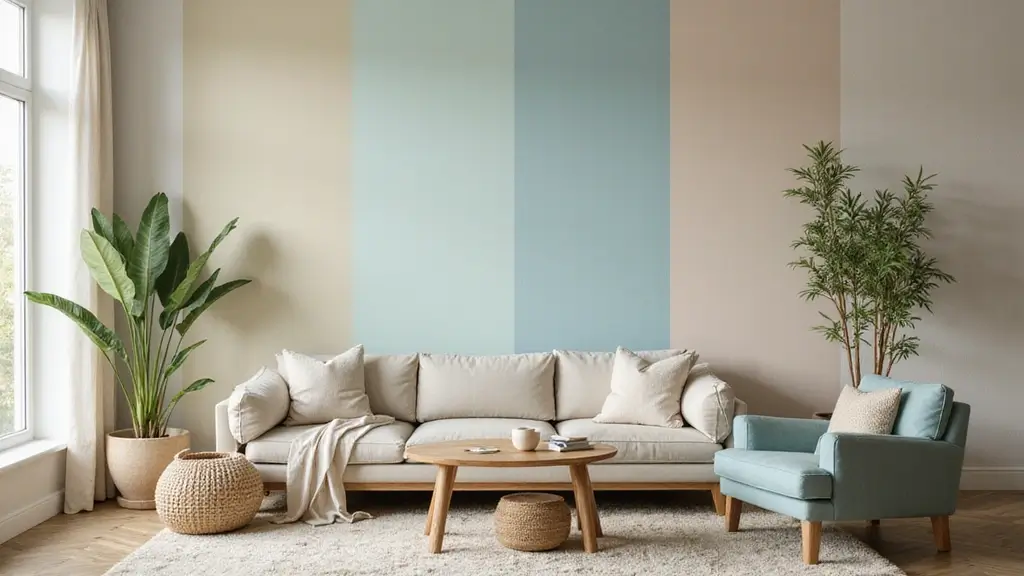
Choosing the right wall paint colors can transform your living space into a sanctuary of style and peace.
The colors you select influence not only the aesthetics of your home but also your mood and well-being. From tranquil blues to vibrant yellows, every hue has a story to tell.
In a world where eco-friendly practices are becoming increasingly important, selecting sustainable paint options can enhance both your home decor and your environmental footprint. This guide explores 26+ captivating wall paint colors that not only uplift your home’s aesthetics but also promote a healthier planet.
1. Soft Sage Green: Nature’s Embrace

Soft sage green evokes the refreshing calm of nature, making it a fantastic choice for bedrooms and living rooms. Its subtle traits bring a sense of peace, perfect for unwinding after a hectic day. Paired with natural wood elements, this shade helps create a serene environment.
for using sage green:
– Combine with crisp whites or light creams for a clean, airy feel.
– Use darker accessories to create contrast and depth.
– Consider plant decor to enhance the natural vibe.
This eco-friendly paint option is often made with natural pigments, making it safer for indoor air quality.
2. Deep Ocean Blue: The Tranquil Retreat

Deep ocean blue channels the soothing essence of the sea, wrapping your space in tranquility. Ideal for spaces intended for relaxation, such as bedrooms and reading nooks, this color can have a calming effect on your mood.
Design ideas:
– Pair with warm, earthy tones like rust or terracotta for warmth.
– Use white trim to make the blue pop and add brightness.
– Light warm lighting can create a cozy atmosphere.
This rich hue is often derived from eco-friendly materials, making it a top choice for sustainable home decor.
3. Soft Blush Pink: Subtle Elegance

Soft blush pink radiates warmth and comfort, creating an inviting atmosphere in any space. Whether it’s a playful nursery or an elegant dining area, this color brings a touch of soft elegance that’s both modern and timeless.
To enhance blush pink:
– Combine with cool grays or whites to balance warmth.
– Use delicate gold accents to elevate the sophistication.
– Pair with greenery for a lively contrast.
Look for low-VOC (volatile organic compounds) versions of this color, ensuring a healthier environment for your family.
4. Warm Terracotta: Earthy Comfort

Warm terracotta tones bring the richness of earth into your home, creating a cozy and inviting atmosphere. This color resembles the warmth of clay, making it ideal for kitchens or living rooms where comfort is key.
Design suggestions:
– Pair with natural woods for a rustic feel.
– Use white or cream furniture to create contrast.
– Incorporate textured fabrics like linen or wool for added warmth.
The eco-friendly options available for terracotta often include clay-based paints that are sustainable and safe.
Warm terracotta tones bring earthy comfort to your home. Embrace the natural warmth and create a cozy space that invites relaxation and joy!
5. Cool Misty Gray: Modern Minimalism

Misty gray offers a sleek and modern vibe, perfect for creating a sophisticated backdrop in contemporary homes. This versatile color works wonderfully in living rooms or offices, promoting focus and calmness.
To enhance misty gray:
– Use bold accents in bright colors to add pops of interest.
– Pair with metallic decor for a modern edge.
– Layer with soft textiles to balance the coolness of the color.
Opt for eco-friendly gray paints that use natural pigments to ensure a healthier interior.
6. Bright Mustard Yellow: Cheerful Vibes

Bright mustard yellow infuses energy and warmth into any space, perfect for kitchens or playrooms where activity thrives. This shade brings sunshine indoors, making it a delightful choice for invigorating your home.
Best practices:
– Use as an accent wall to avoid overwhelming the space.
– Combine with gray or navy for a contemporary touch.
– Include natural light to brighten the yellow, enhancing its vibrancy.
Eco-conscious brands offer low-impact mustard options that are fun and sustainable.
7. Gentle Lavender: Soft Serenity

Gentle lavender brings a sense of tranquility and grace, making it a beautiful option for bedrooms or meditation spaces. This soft hue promotes relaxation and a restful night’s sleep.
Design ideas:
– Pair with whites or soft creams for a calming ambience.
– Incorporate metallic accents for a modern touch.
– Use natural fabrics to enhance the soft feel.
Consider eco-friendly lavender paints that utilize natural ingredients, supporting both your health and the environment.
8. Vibrant Coral: Energizing Charm

Vibrant coral is the lively hue that adds a splash of energy to your home. Ideal for spaces meant for socializing, like living rooms or dining areas, this color encourages conversation and fun.
To use coral effectively:
– Combine with neutral shades to prevent overwhelming the space.
– Use in small doses as an accent to highlight decor.
– Pair with natural materials like rattan or jute for balance.
Choose eco-friendly coral paints that are free from harmful chemicals, making it safe for indoor use.
9. Soft Cream: Classic Warmth

Soft cream is a classic choice that brings warmth and light to any space. This neutral shade works beautifully in all types of homes, adding an element of elegance and calmness.
Usage tips:
– Pair with deeper colors for contrast and depth.
– Use in smaller spaces to create an illusion of a larger area.
– Accentuate with natural materials for a harmonious look.
Eco-friendly cream paints often contain natural oils, ensuring a healthier living space.
Soft cream isn’t just a color; it’s a feeling. Embrace its warmth to brighten up your space and pair it with deeper hues for striking contrast. Create a serene sanctuary with eco-friendly wall paint colors that uplift your mood!
10. Charcoal Gray: Bold Sophistication

Charcoal gray adds a touch of bold sophistication to any room. This shade works well in modern settings and can also create a dramatic effect in traditional homes, making it incredibly versatile.
Styling suggestions:
– Use as a statement wall to anchor the space.
– Pair with lighter colors to create contrast.
– Add abundant lighting to enhance the richness of the charcoal.
Look for eco-friendly charcoal options that utilize low-VOC formulas to maintain air quality.
11. Earthy Olive Green: Grounded and Balanced

Earthy olive green embodies the beauty of nature and brings a sense of calmness. It’s perfect for dining rooms or studies, where you want to promote conversation and creativity.
Ways to style olive green:
– Combine with warm wood tones for a harmonious look.
– Use it alongside bright whites to keep the space fresh.
– Add greenery for an organic feel.
Opt for eco-friendly olive paint options, often made with plant-based ingredients, aligning with sustainable decor choices.
12. Chic Teal: Refreshing Energy

Chic teal brings a refreshing energy to any room and pairs well with both modern and traditional decor. This lovely hue is perfect for accent walls in bedrooms or living spaces, offering a pop of color without overwhelming the senses.
Considerations for teal:
– Combine with warm neutrals for balance.
– Use metallics for a glamorous touch.
– Incorporate natural elements to ground the color.
Eco-friendly teal paints are often crafted with minimal environmental impact, making them a great choice for the conscious homeowner.
13. Rustic Ochre: Warm Heritage

Rustic ochre exudes warmth and embodies the beauty of nature, making it a charming choice for country-style homes. This earthy tone complements wooden furniture and textiles, creating a cozy, inviting atmosphere.
for using ochre:
– Pair with deep greens for a natural palette.
– Use as an accent in smaller spaces to avoid overwhelming.
– Incorporate textured fabrics and rustic decor for a complete look.
Seek eco-friendly paint options that reflect the richness of ochre while being gentle on the environment.
Rustic ochre brings the warmth of nature indoors, transforming your home into a cozy retreat. Pair it with deep greens for a harmonious palette that breathes life into every corner!
14. Calming Aqua: Refreshing Coolness

Calming aqua instantly rejuvenates a space, providing a fresh and airy feel. Perfect for bathrooms or kitchens, this color promotes cleanliness and tranquility. The refreshing vibe of aqua can set the tone for a serene environment.
Incorporation ideas:
– Combine with whites for a coastal feel.
– Use metallic accents to elevate the overall style.
– Pair with natural wood for a balanced look.
Choose eco-friendly aqua paints that harness the rejuvenating qualities of nature without harmful chemicals.
15. Bold Burgundy: Rich and Regal

Bold burgundy provides a rich, dramatic ambiance in any room. This deep shade is perfect for creating a statement in dining rooms or libraries, encouraging intimacy and warmth.
Design suggestions:
– Pair with lighter shades for a classic contrast.
– Add gold accents for a touch of luxury.
– Use soft, warm lighting to enhance its richness.
Look for sustainable burgundy paint options that maintain their vibrance while also being environmentally friendly.
16. Serene Sky Blue: Endless Calm

Serene sky blue invites a sense of peace and tranquility, making it an excellent choice for bedrooms and relaxation areas. This soothing color helps to promote relaxation and can even aid in better sleep.
Best practices:
– Combine with whites for a fresh look.
– Use soft textures to enhance the calming vibe.
– Incorporate natural light to brighten up the room.
Opt for eco-friendly sky blue options that prioritize low environmental impact, ensuring a healthier home.
17. Rich Forest Green: Invigorating Nature

Rich forest green is like a deep breath of fresh air, evoking a sense of nature and renewal. This shade works beautifully in home offices or reading rooms, creating a focused and invigorating environment.
Incorporation tips:
– Pair with wood for warmth and coziness.
– Add white or cream details to lighten the look.
– Include plants to enhance the organic feel.
Look for eco-friendly forest green paints that utilize sustainable practices for a healthier living space.
18. Warm Sand: Coastal Calm

Warm sand evokes beach vibes and tranquility, making it an ideal choice for coastal-themed homes. This gentle hue promotes relaxation and pairs well with bold accents.
Styling ideas:
– Combine with blues for a coastal palette.
– Use natural textures to enhance the beachy feel.
– Pair with vibrant accents for a pop of color.
Choose eco-friendly warm sand paints that reflect the beauty of nature without harmful chemicals.
Warm sand paints create a serene escape in your home, reflecting the tranquility of the beach. Embrace eco-friendly options to elevate your decor while caring for the planet!
19. Crisp White: Timeless Simplicity

Crisp white never goes out of style and is the ultimate neutral. It can create the illusion of more space and brightness, making small areas feel larger and more open. This timeless choice is perfect for any room.
to maximize white:
– Use colorful accents to add personality.
– Incorporate various textures for depth.
– Pair with natural materials for warmth.
Look for eco-friendly white paints that offer durability and a clean finish while being gentle on the environment.
20. Soft Denim Blue: Cozy and Inviting

Soft denim blue brings a cozy and inviting feel to spaces. Perfect for family rooms or bedrooms, this color provides a comforting backdrop while exuding a relaxed vibe.
Best practices:
– Pair with whites or soft creams for a fresh look.
– Use warm lighting to enhance the coziness.
– Incorporate natural fabrics for an organic touch.
Eco-friendly denim blue options often utilize natural pigments, contributing to a healthier indoor environment.
21. Vibrant Raspberry: Playful and Fun

Vibrant raspberry adds a playful and fun energy to any space, making it perfect for children’s rooms or creative areas. This lively color promotes joy and creativity, encouraging an energetic atmosphere.
Incorporation ideas:
– Use as an accent wall to highlight playfulness.
– Pair with other bold colors for a fun palette.
– Include playful decor to match the vibrant theme.
Eco-friendly raspberry paints are available, featuring safe ingredients that keep your home healthy.
22. Soft Honey: Warmth and Comfort

Soft honey adds warmth and comfort, making it ideal for a cozy atmosphere in living rooms or bedrooms. This inviting hue works well with both modern and traditional styles, enhancing the aesthetics of any space.
Design considerations:
– Pair with deep browns for a richer palette.
– Use white for contrast and brightness.
– Incorporate textiles and patterns for added depth.
Look for eco-friendly honey paint options that prioritize sustainable practices, promoting both comfort and ecological responsibility.
23. Deep Plum: Luxurious Depth

Deep plum adds a touch of luxury and sophistication, making it perfect for more formal spaces like dining rooms or studies. This rich hue creates a dramatic effect that can make a room feel more intimate and elegant.
Best practices:
– Pair with light colors for contrast.
– Use warm lighting to enhance richness.
– Include gold or brass accents for an upscale feel.
Eco-friendly plum paint options are available and are gentle on the environment, ensuring your home remains a healthy space.
24. Muted Mustard: Vintage Charm

Muted mustard offers a vintage vibe and a warm, welcoming atmosphere, making it great for kitchens or entryways. This nostalgic tone promotes cheerfulness while remaining sophisticated.
Incorporation ideas:
– Combine with dark woods for a rich contrast.
– Use alongside cream or soft white to lighten the space.
– Add vintage decor pieces to enhance the charm.
Choose eco-friendly muted mustard paints that embrace sustainable practices, supporting both aesthetics and the planet.
25. Earthy Beige: Neutral Harmony

Earthy beige acts as a perfect canvas that supports various designs and styles. This neutral color creates a harmonious flow throughout your home, making it an excellent choice for open-concept spaces.
for using beige:
– Pair with vibrant colors for contrast and depth.
– Use natural textures to add warmth.
– Incorporate plants for a fresh, organic feel.
Opt for eco-friendly beige paints that are safe for indoor use, ensuring a comfortable and healthy living space.
26. Calm Seafoam: Refreshing Serenity

Calm seafoam creates a refreshing vibe that fosters tranquility and peace. Ideal for bathrooms or bedrooms, this color promotes relaxation and rejuvenation.
Best practices:
– Pair with crisp whites for a clean look.
– Use natural materials to enhance the serene atmosphere.
– Incorporate varying textures for depth.
Look for eco-friendly seafoam paint options that embrace nature in their formulations, supporting your sustainable lifestyle choices.
Conclusion: Your Next Step in Home Transformation

Choosing the right wall paint colors can profoundly impact your home’s aesthetics and ambiance.
By embracing eco-friendly options, you not only beautify your space but also contribute to a healthier planet. Let the colors you choose reflect your personality and style, creating a sanctuary that inspires joy and comfort in your daily life.
Frequently Asked Questions
What are the best wall paint colors for creating a calming atmosphere?
If you’re looking to create a calming atmosphere, consider colors like soft sage green or deep ocean blue. These hues evoke nature and tranquility, making them ideal for bedrooms and relaxation spaces.
Soft sage green encapsulates the refreshing calm of nature, while deep ocean blue channels the soothing essence of the sea. Both colors can help you unwind and promote peace in your living space.
How do I choose eco-friendly wall paint colors for my home?
Choosing eco-friendly wall paint colors involves looking for paints that have low volatile organic compounds (VOCs) and are made from sustainable materials. Opt for brands that prioritize environmental responsibility and offer a range of colors.
Consult color psychology to pick shades that resonate with your desired mood, such as gentle lavender for tranquility or vibrant coral for energy.
Can wall paint colors really affect my mood and emotions?
Absolutely! Wall paint colors can significantly influence your mood and emotions through color psychology. For instance, warm tones like soft blush pink radiate warmth and comfort, while cool colors like calming aqua promote relaxation.
By selecting the right colors for each room, you can create an atmosphere that aligns with your emotional needs and enhances your home aesthetics.
What are some current paint trends that I should consider for my home decor?
Current paint trends emphasize natural and earthy tones, such as earthy olive green and warm terracotta, which bring an inviting feel to your space.
Additionally, bold colors like charcoal gray and deep plum are popular for creating dramatic focal points. Don’t shy away from playful accents like vibrant raspberry to add a fun twist to your decor!
How can I use different wall paint colors to transform my living space?
To transform your living space, consider using a mix of colors strategically. For example, pair a soft cream as a base with an accent wall in chic teal for a refreshing touch.
Utilizing different shades can help define spaces within open floor plans or create cozy corners. Remember, the right combination can elevate your home aesthetics and enhance the overall vibe of your environment!
Related Topics
wall paint colors
eco-friendly paint
color psychology
interior design
home aesthetics
sustainable decor
paint trends
living space transformation
color combinations
modern minimalism
cozy atmospheres
vintage charm